
YOUR BRAND,
YOUR PROMISE,
YOUR PERSONALITY.
Crafting brands that deliver
on your promise and your purpose.
Case Study #1:
John Deere Financial -
Crop Insurance
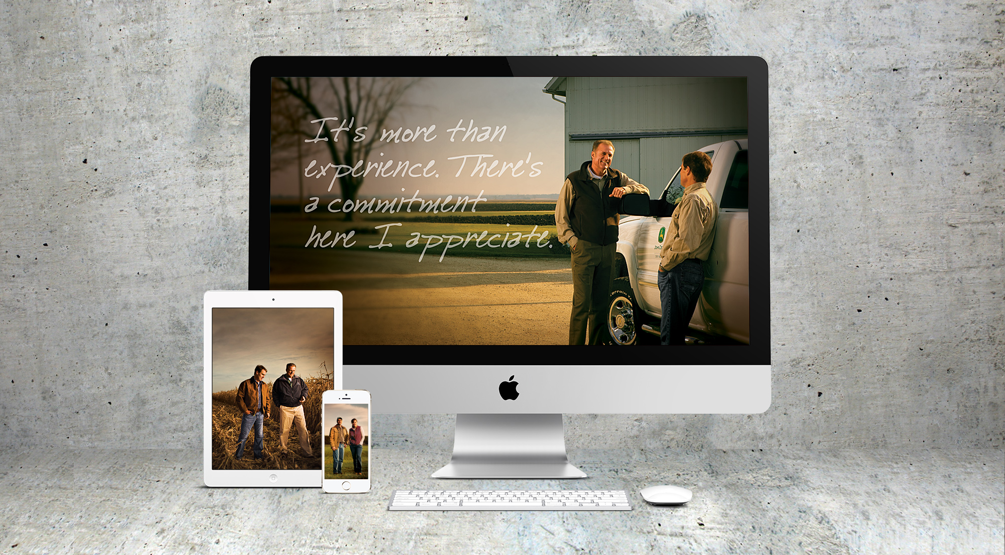
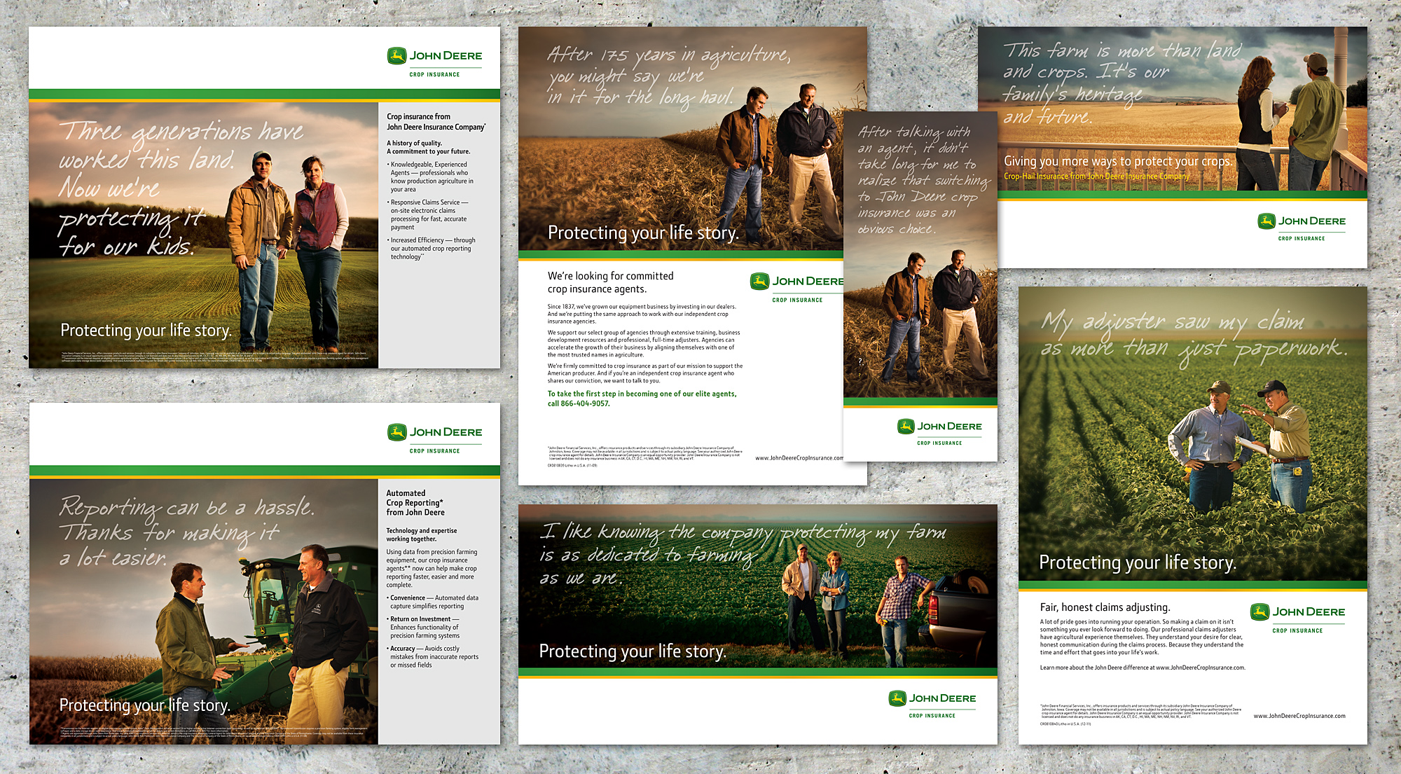
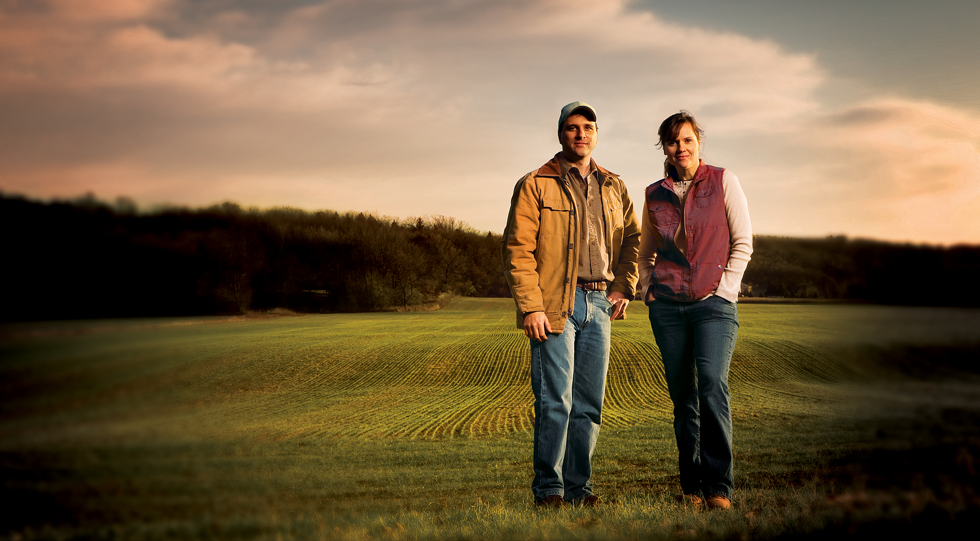
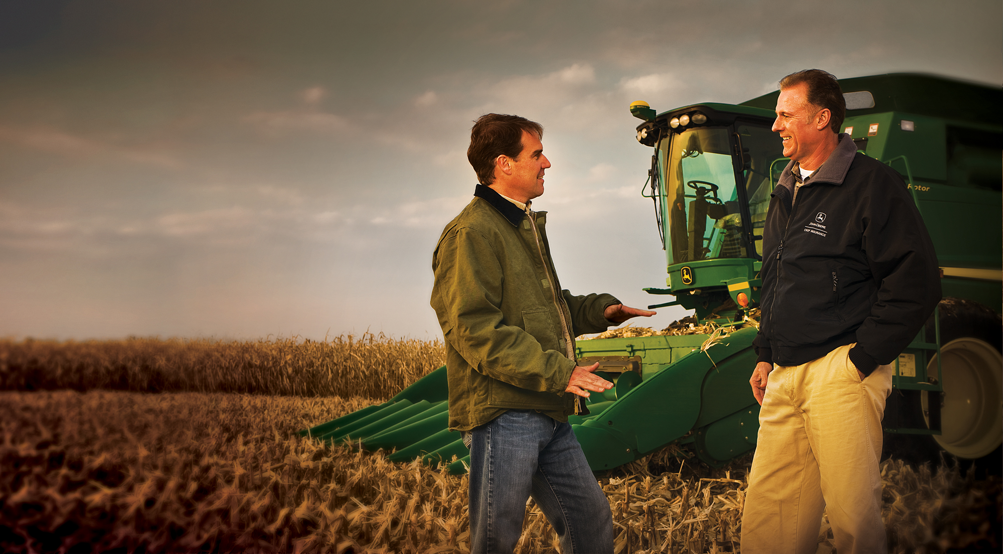
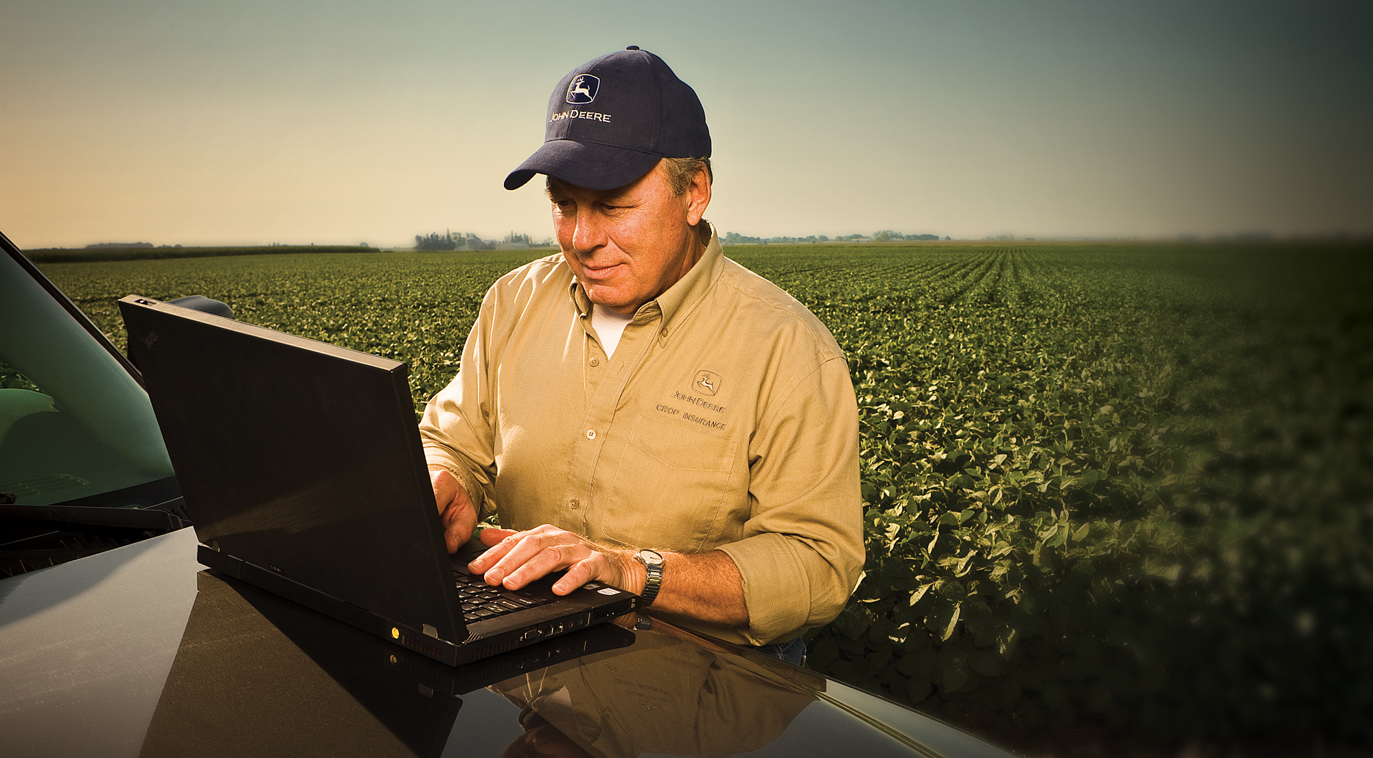
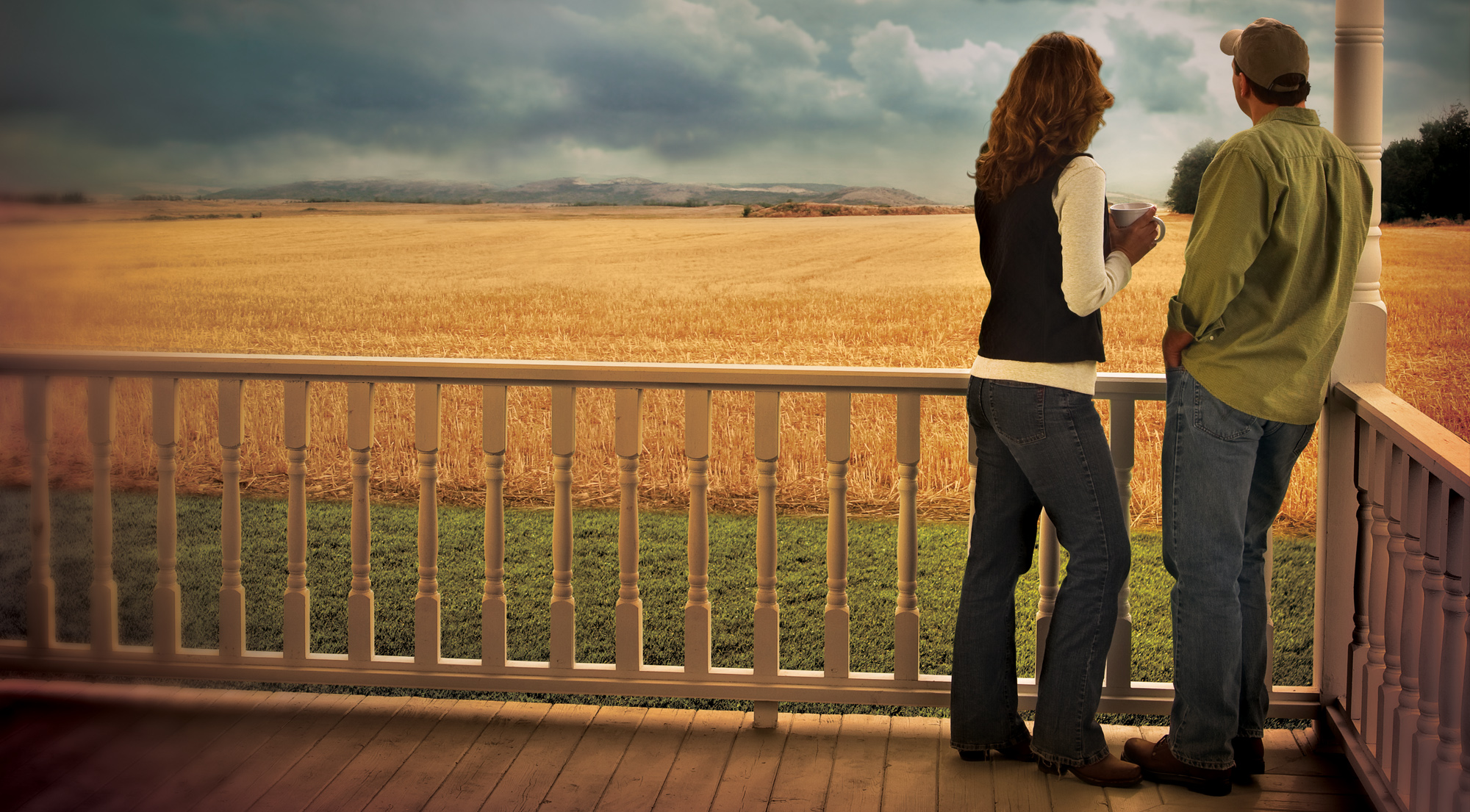
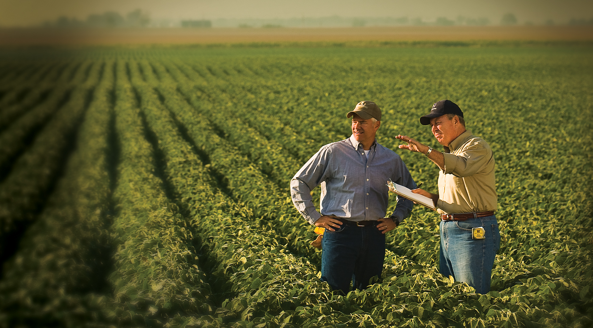
For the new launch of John Deere Crop Insurance back into the marketplace several platforms were developed and explored. Working with existing brand guidelines each platform needed to work within those established parameters. Tone of Voice, Photography, Brand Strategy all played a key role in the final selection. The main idea was to highlight the strong connection a producer has with his land, family and heritage, to tell their story. And by doing so to show the importance of having the right partner in protecting that lifestyle.
In the end the "Life Stories" platform best fit all the criteria needed to represent such an iconic company.
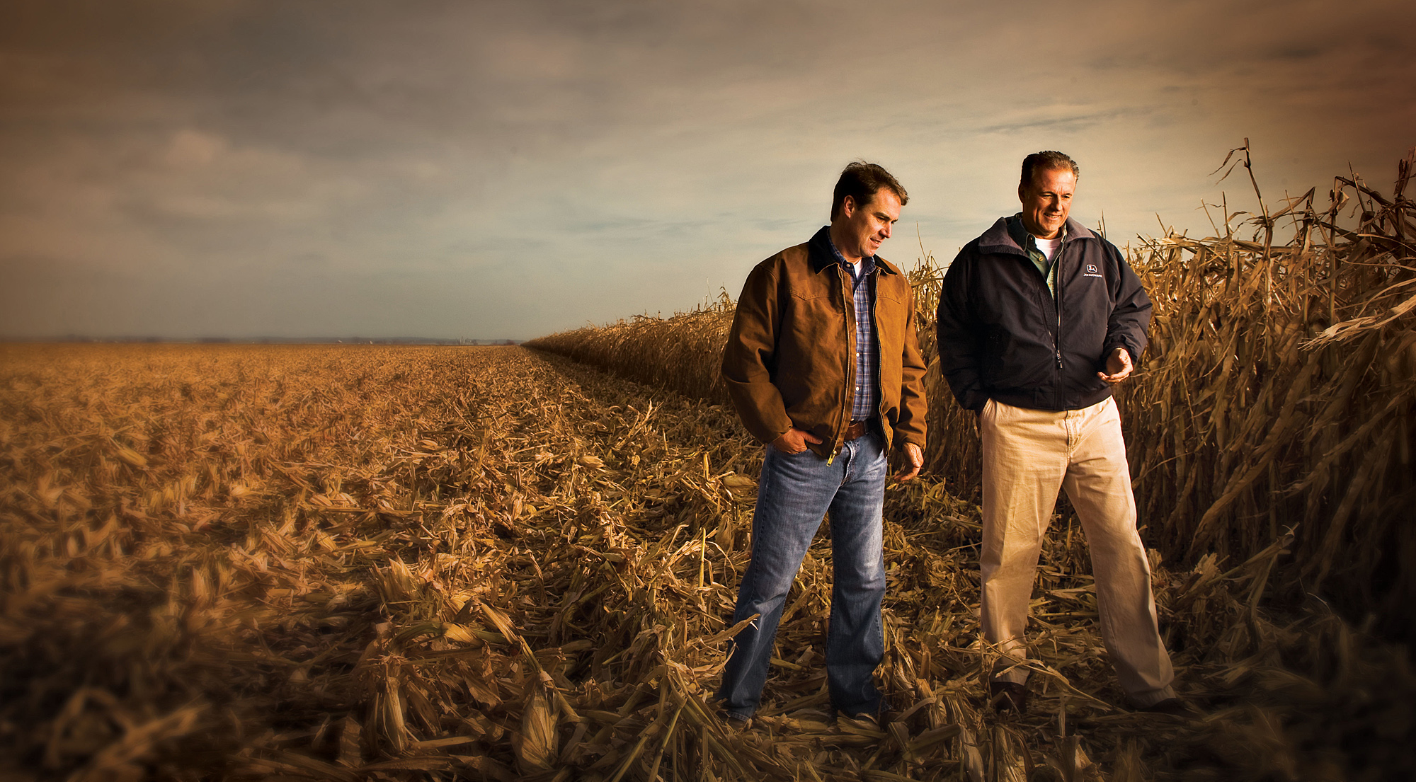
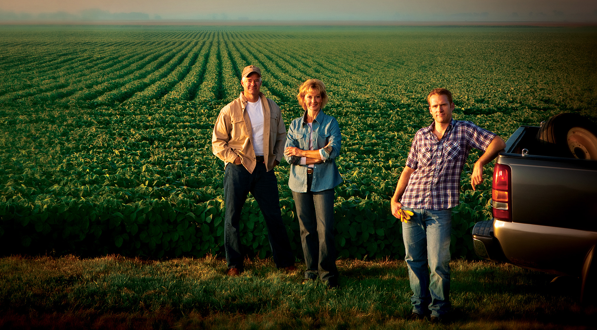
For the campaign photography style was key in setting the right tone and feel for the brand. Warm saturated color imagery was created in post to create this feel across all forms of communications and cary through the John Deere personality.
Results:
After a successul launch both Agents and customers alike were very excited to have John Deere back as a player in the industry.
Concept & Art Direction:
Jeff Joyner
Photography by:
David Mjolsness
Retouching & Post work:
Hac Job


Case Study #2:
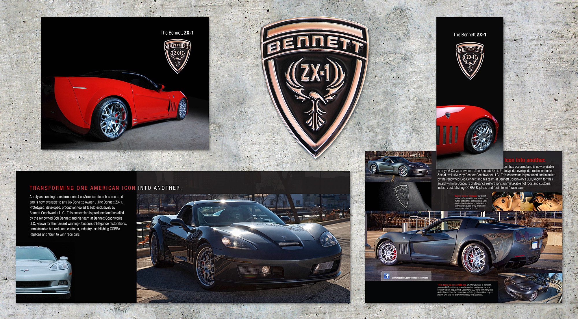
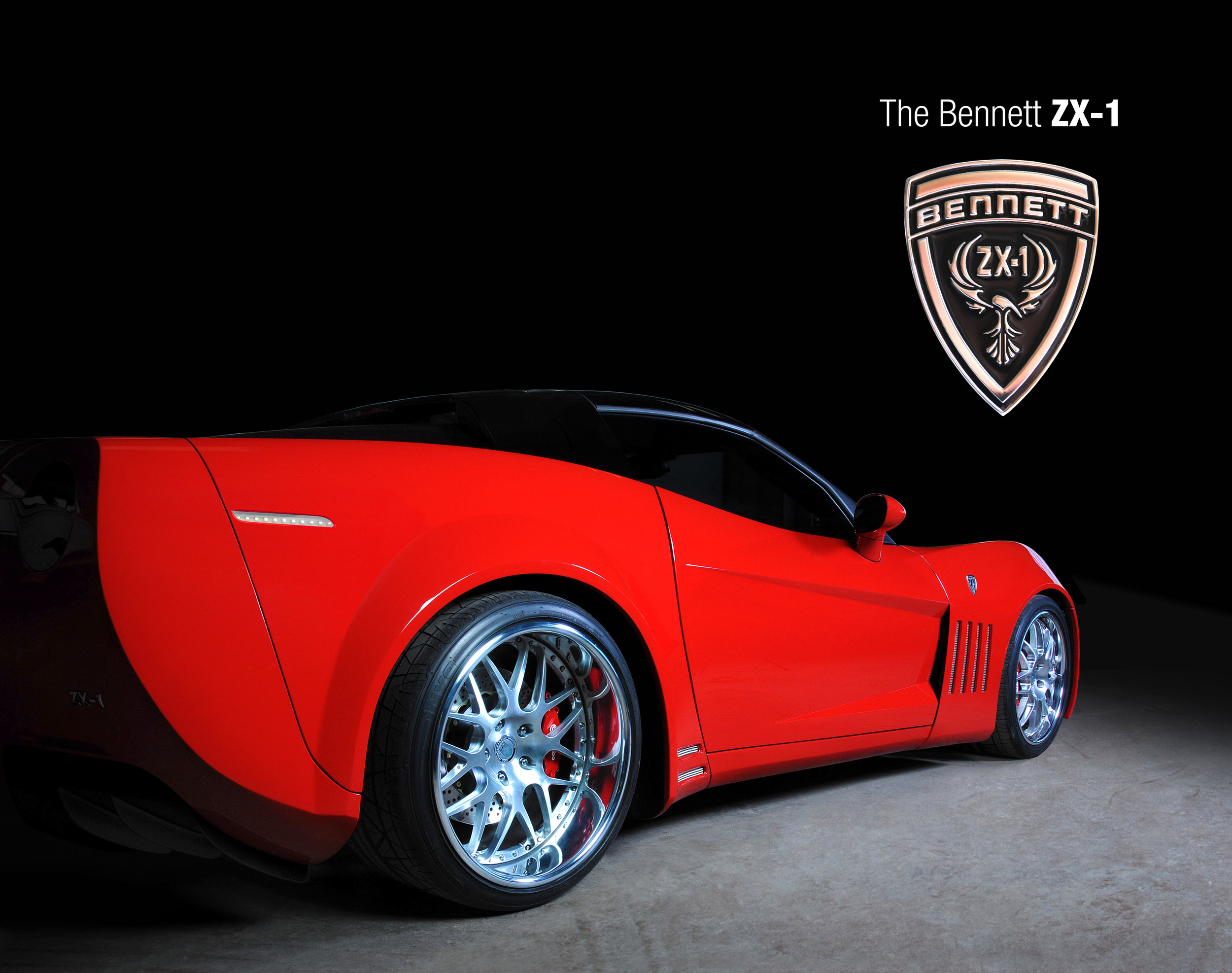
Bennett Coachworks -
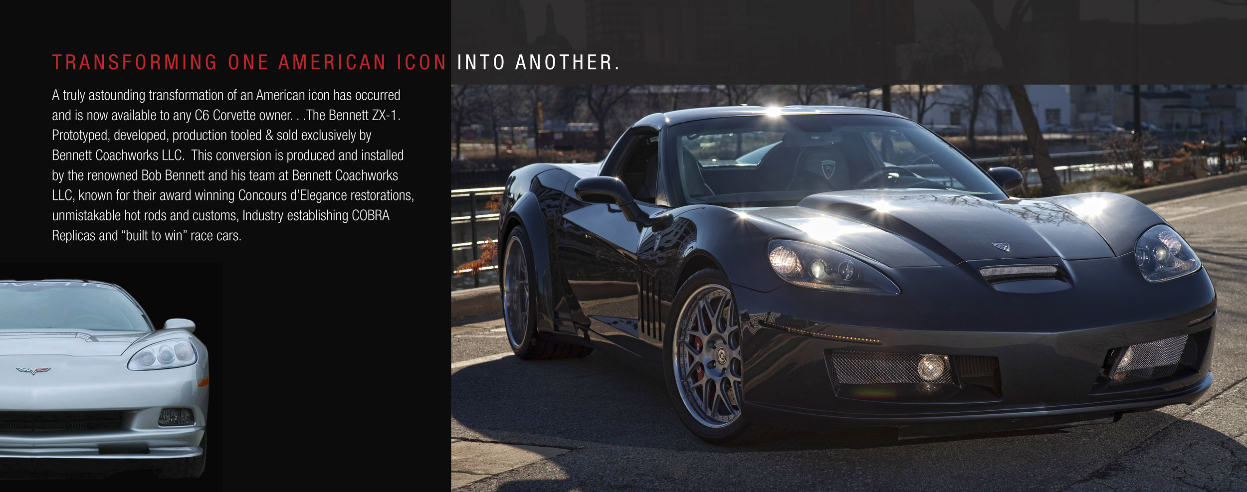
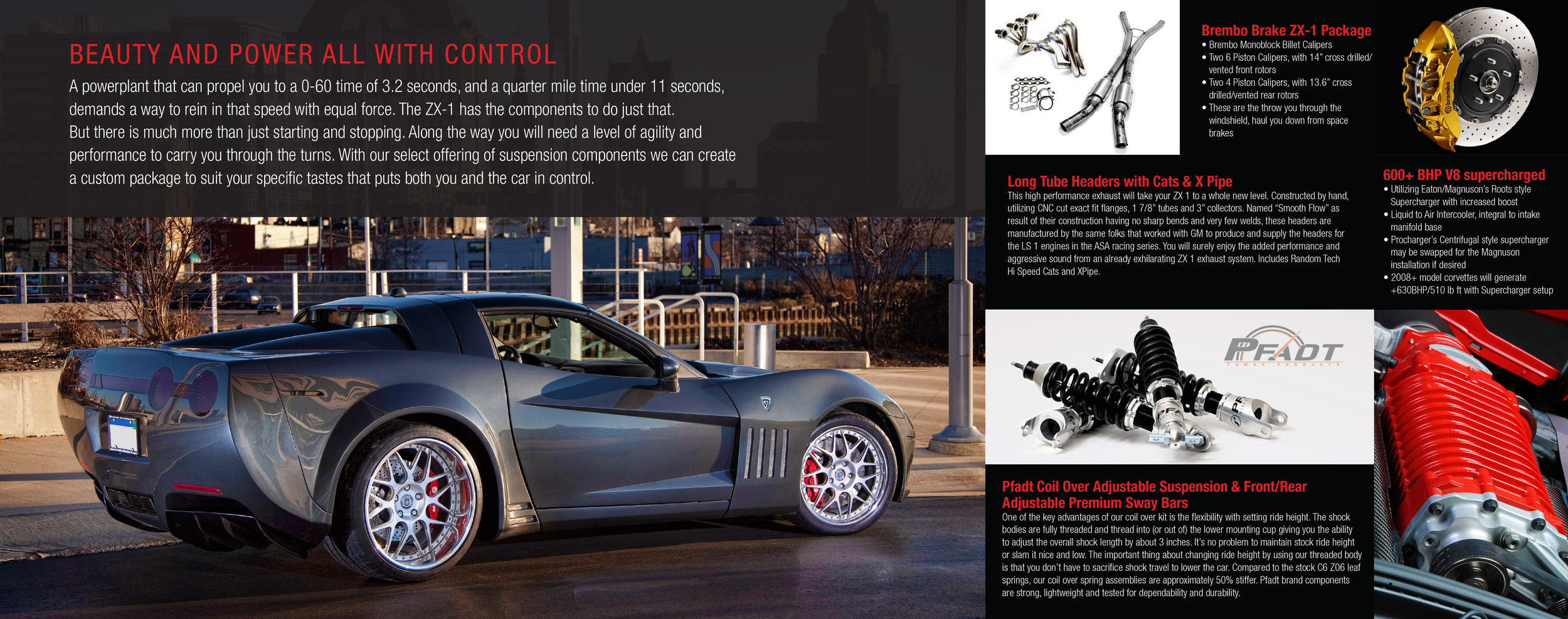
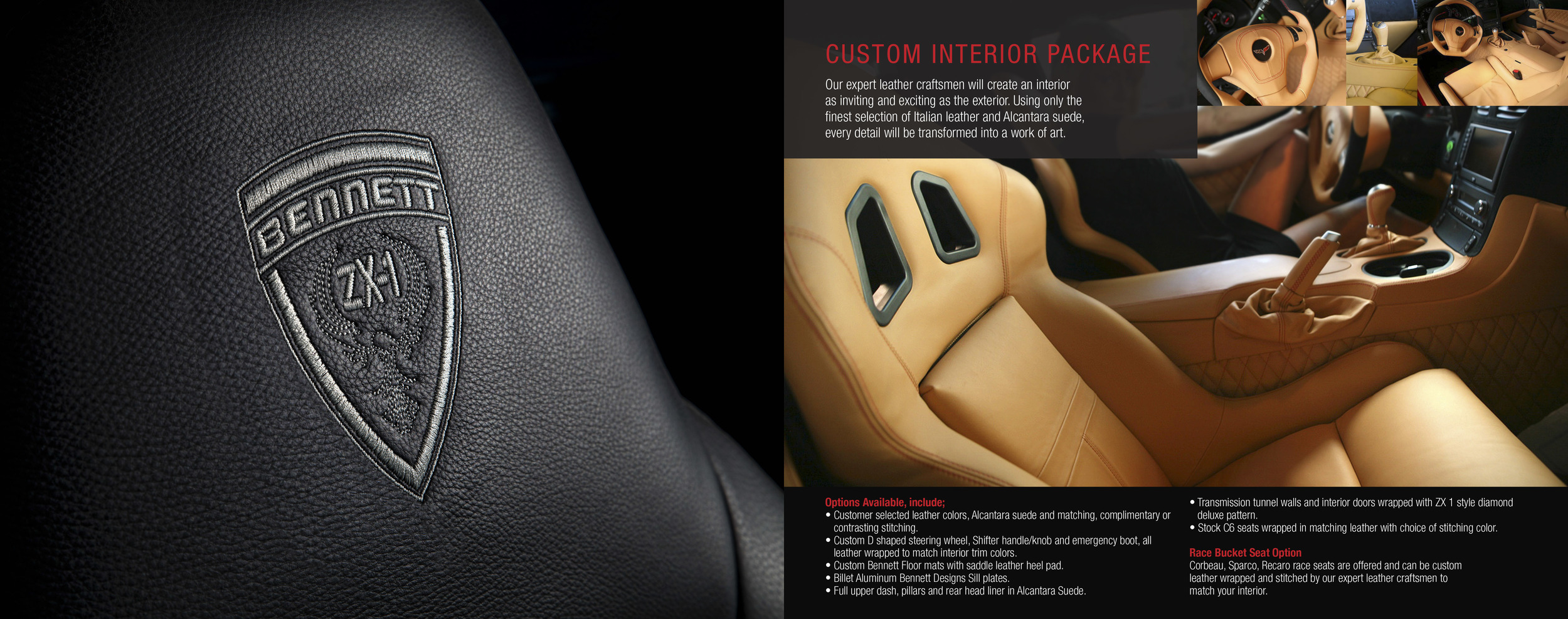
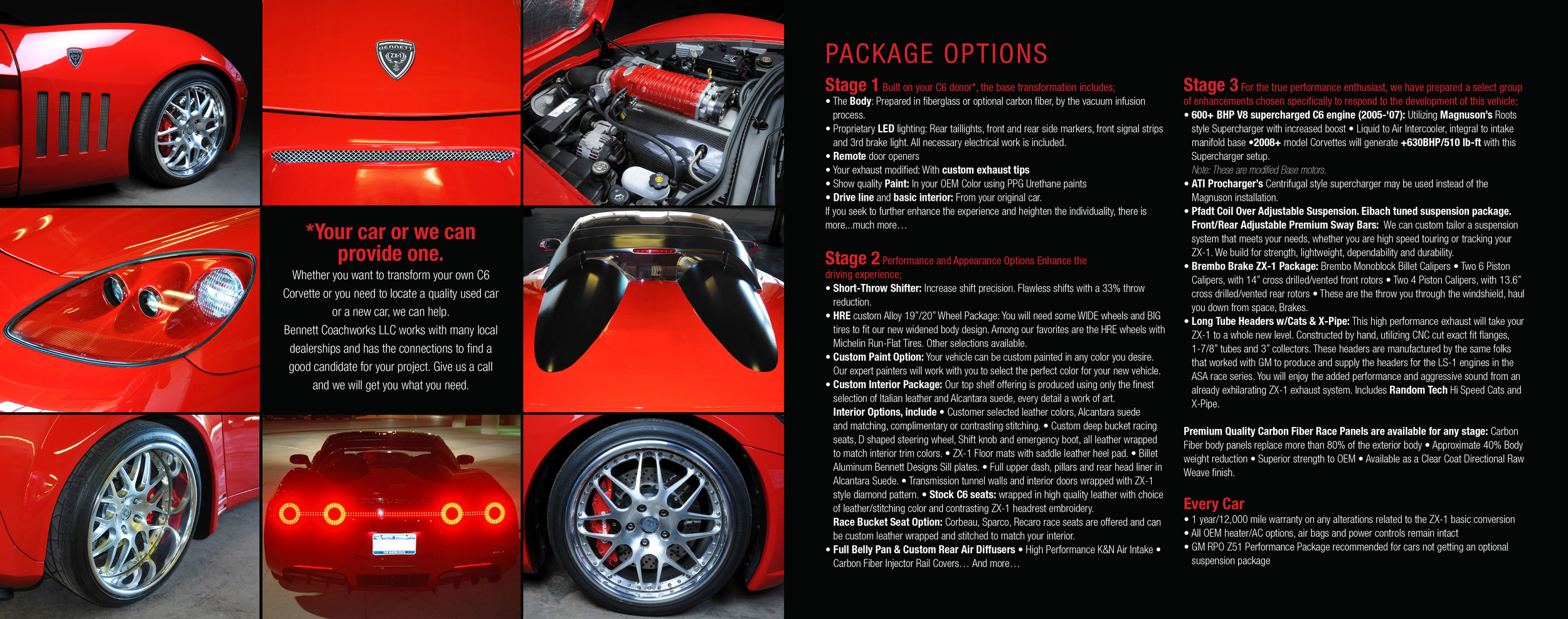
ZX-1 "Transforming one American Icon into another."
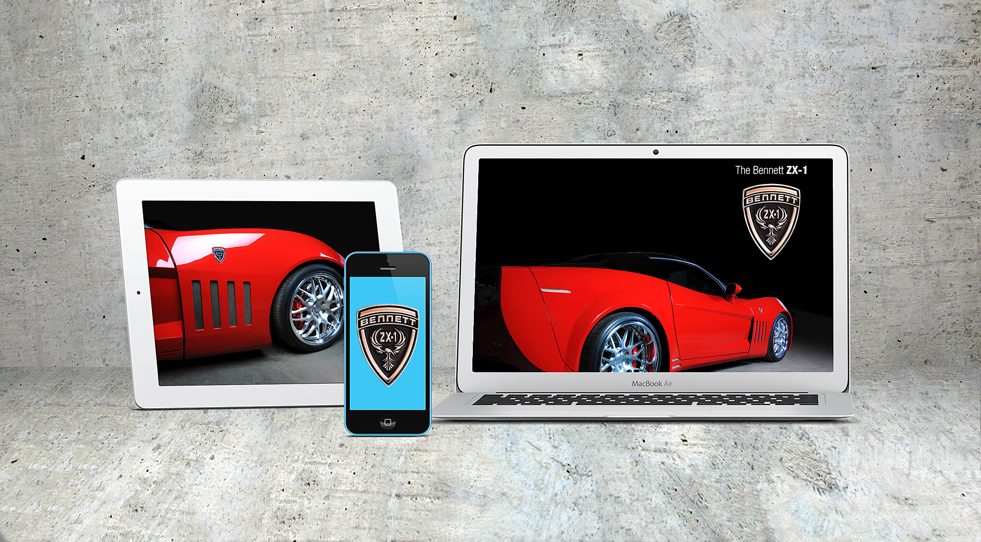
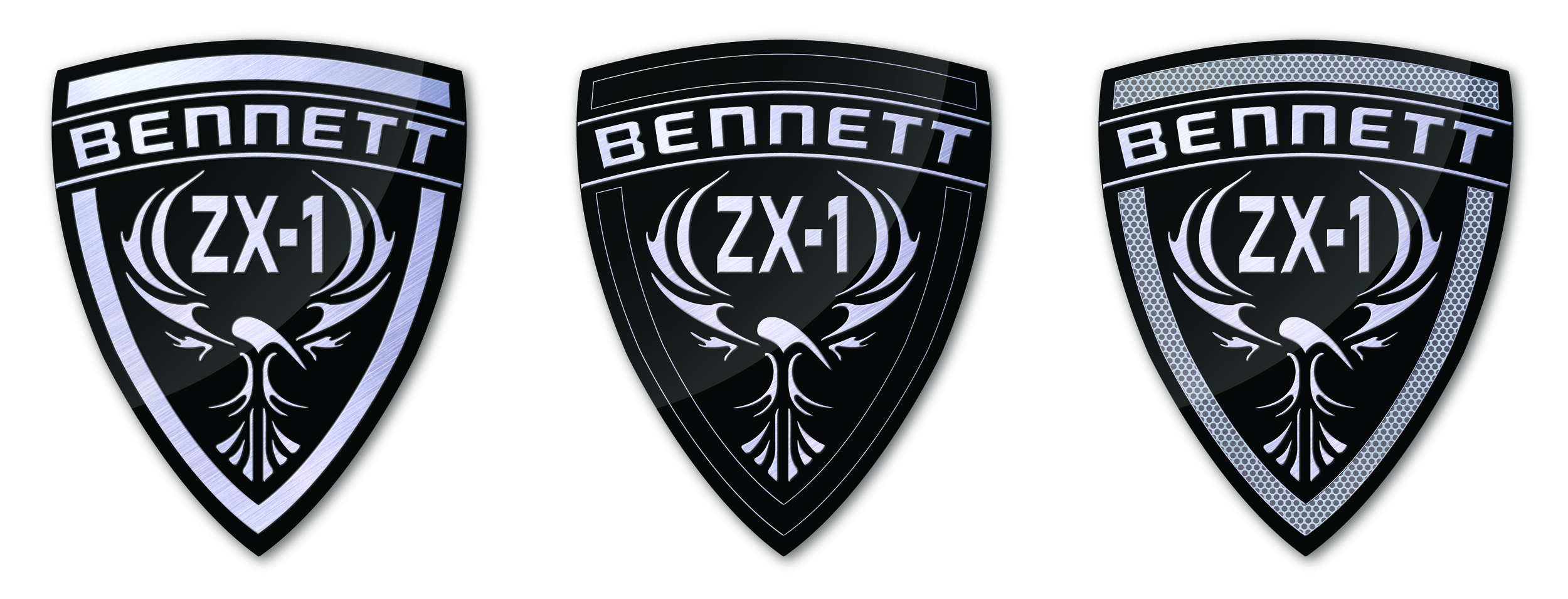
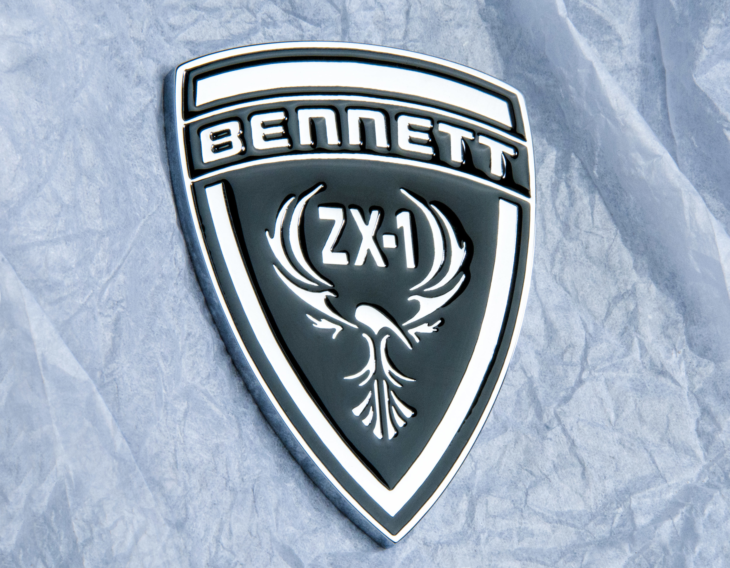
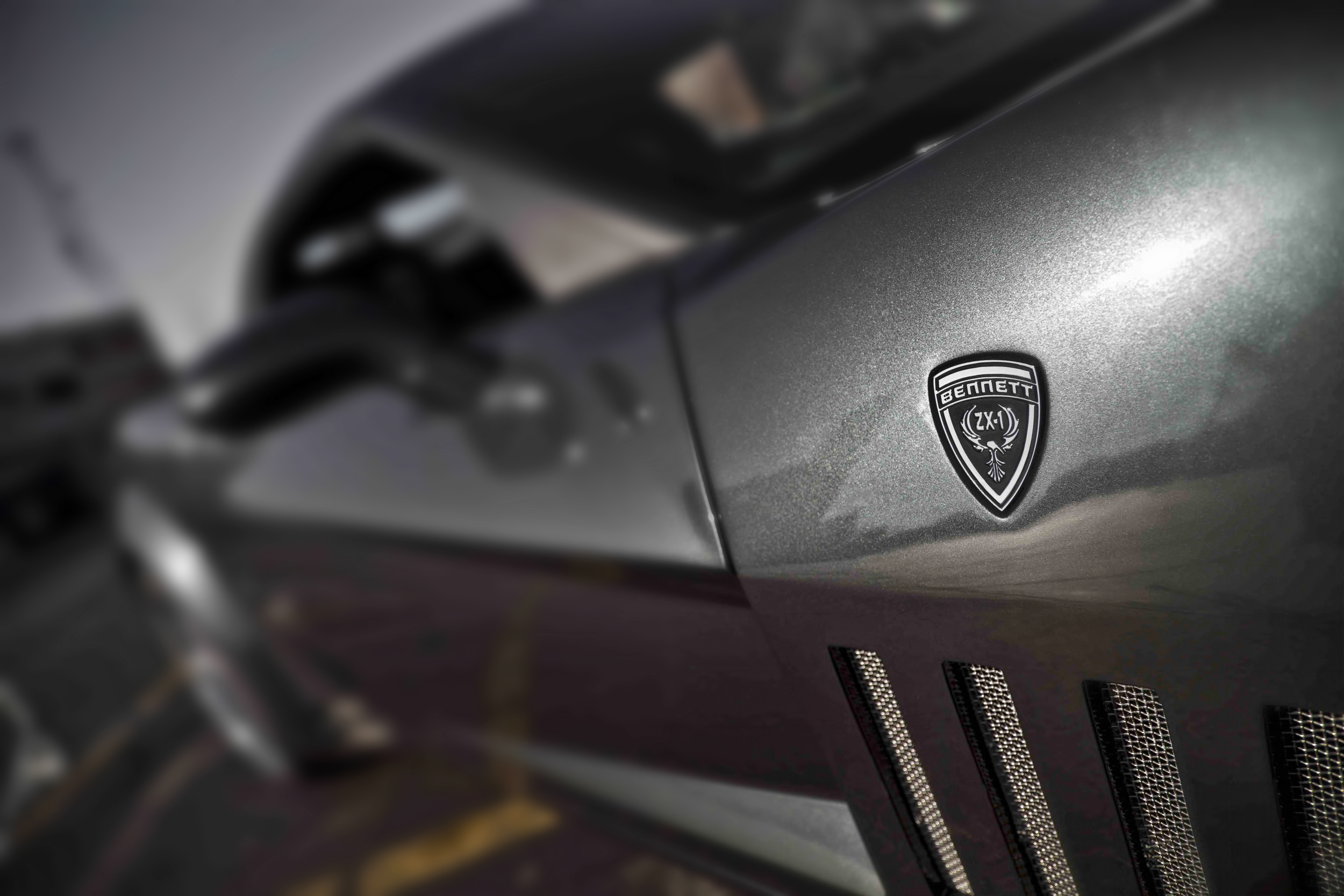
The ZX-1 is a conversion of a stock C6 Corvette offering a complete car redesign. It allows the owner the flexibility of choosing a styling and performance package of his or her choice. Having been a client of Bennett Coachworks LLC and knowing their award winning work they do I was asked to assist in the launch of their new ZX-1 project. The assignment called for two distinct phases to meet a tight launch deadline. The first was to redesign the car emblem that would appear prominently on the hood and two front side fenders of the car. After reviewing an initial design it was obvious this very important emblem had to be redesigned to match the level of quality and performance of the car. Working closely with the supplier creating the emblems a final series of design options were produced. With each emblem being custom made with a special "casting" process certain production aspects were taken into account and a final design selected. The finished production emblem turned out beautiful and complimented this high performance car.
The second phase was to produce communication pieces that would work across all types a media: print, web, POS, email etc. For the launch a full brochure covering the process, options and general packages was needed. Working with a very tight budget and existing location photography a final layout design was selected. Studio images were then shot to excentuate the beautiful lines and design of the car. This look and feel was then applied across all the remaining communication pieces to create a consistent and high quality feel.
Concept, Art Direction & Design:
Jeff Joyner
Photography:
Studio: Jeff Joyner (red car)
Location: Robert Weiss (gray car)
Retouching:
Jeff Joyner

Case Study #3:
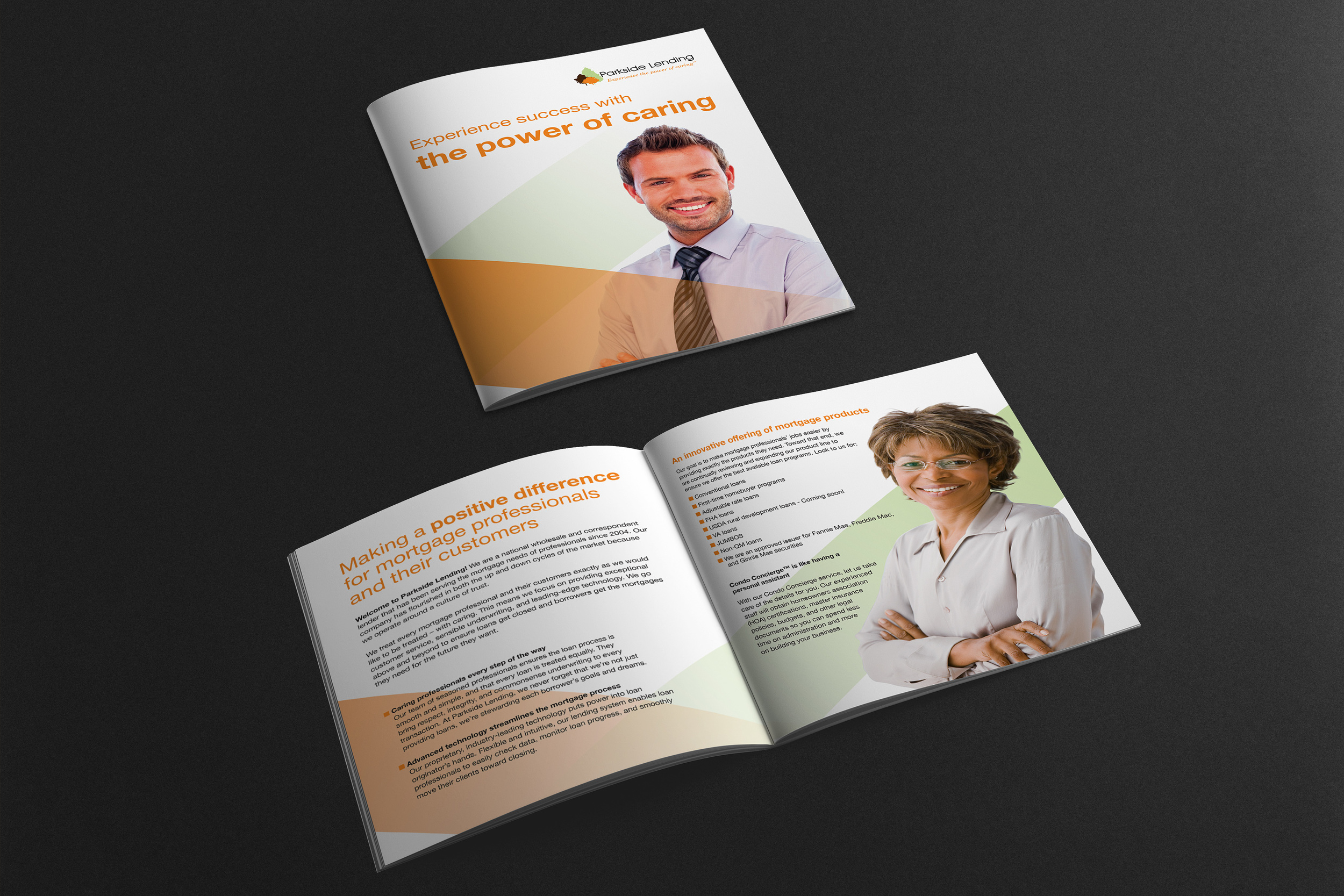
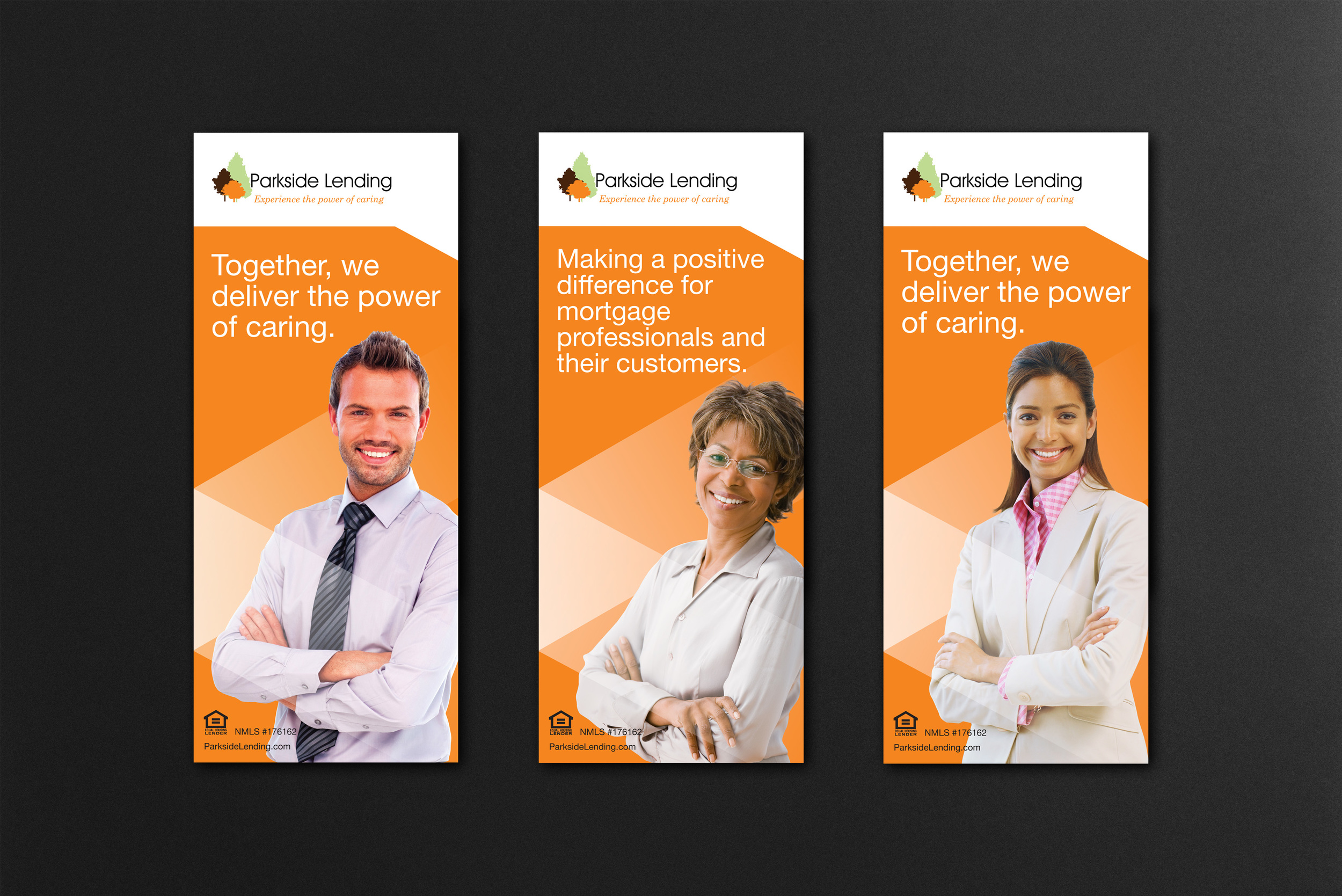
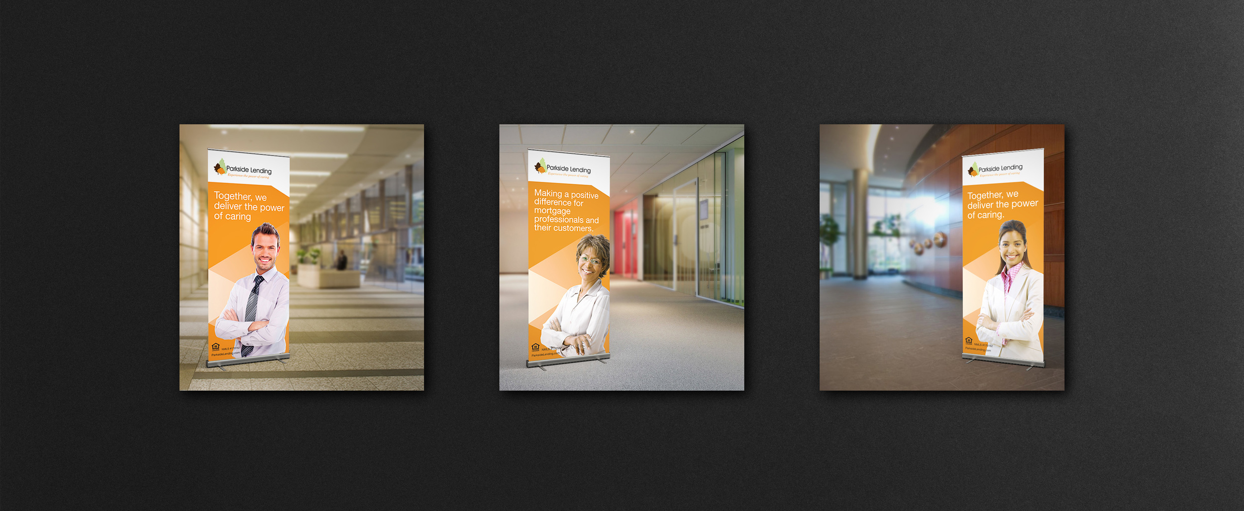
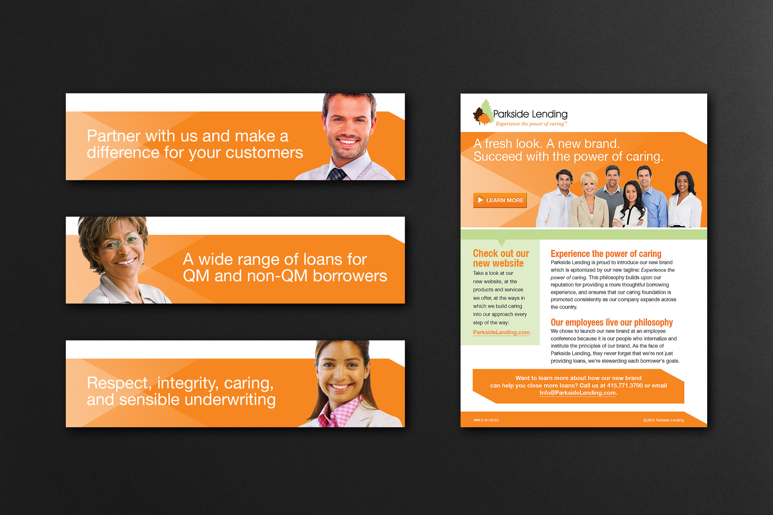
Parkside Lending -
Rebranding
Parkside Lending is a national wholesale and correspondent lender based in San Francisco, California. The company has a strong focus on caring for their clients and its clients customers. To better communicate this they chose to completely rebrand their company. Using their existing logo several platforms were explored prior to deciding on the direction. As part of the initial launch large pop-up banners were created for all of the company's satelite offices. Web, collateral and tradeshow pieces were also produced to showcase the new brand look for the company and customers. Diversity and a strong emphasis on the importance of its employees was a key focus to its new branding initiative.
Concept, Creative Direction & Design:
Jeff Joyner
Retouching & Post work:
Jeff Joyner